Information Architecture & Content Strategy
U.S. Cellular’s Business-to-Business marketing group wanted to communicate a single key message to their customers: U.S. Cellular helps your business become more productive.
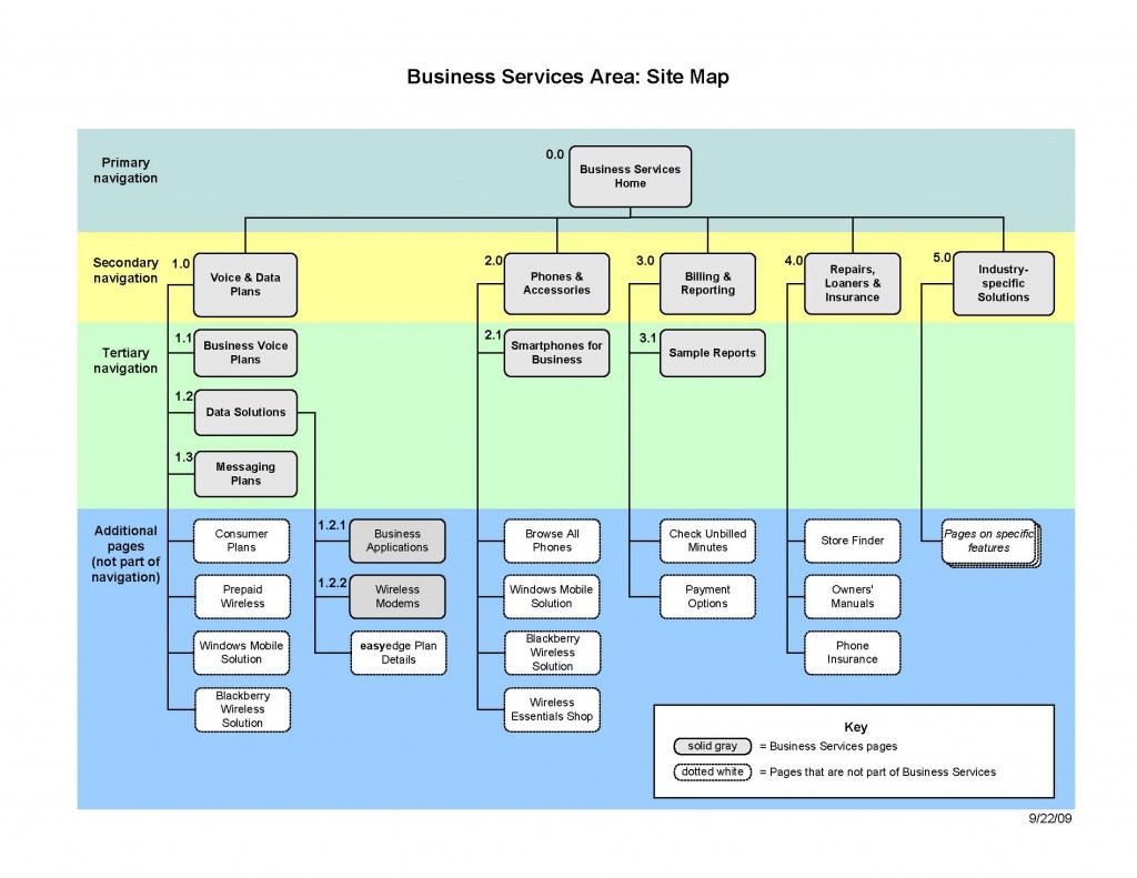
The Business Services section of their website was organized according to the customer’s business size. This made sense to the marketing group because their sales channels were structured the same way, but it didn’t make sense to the customers. The site didn’t have a clear structure, so the Business Services home page became a laundry list of links to information about new features and services.
The site copy contained too many messages about benefits and not enough real information. Important brand differentiators, such as pricing information and a business-specific customer service line, were buried.
Solution
We wanted the user experience to actively demonstrate that U.S. Cellular supports customer productivity. I proposed the following changes to make it faster and easier for visitors to find information and act upon it.
Focusing on User Need, Not Company Size
Products and services are essentially the same for companies of all sizes, so I recommended organizing the content based on common customer questions, such as “what phones do you offer?” and “how do I purchase a plan?”.
Significantly Reducing the Copy
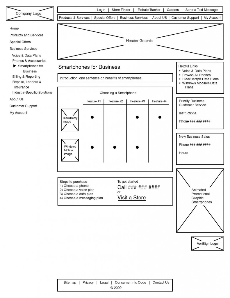
Long paragraphs of text and overbearing marketing messages left visitors with too much to read and process. I recommended cutting 75% of the text, making it easy for visitors to find information about phones, plans and pricing, and then take action.
Presenting Information Visually
Charts, graphs and tables made it easy to choose a phone and compare voice and data plans.


